
-


Subscribe by Email
Popular Posts
Category Archives: PICTURE BOOKS +
little red hood + DIY fairy tale costumes
 Little Red Hood by Marjolaine Leray (translated by Sarah Ardizzone) (2011).
Written in French. Translated to English and published by Phoenix Yard Books.
I’m obsessed with fairy tales and fairy tale retellings. I don’t think I’ve told you guys that! Well, I am. They’re always on my nightstand and they always show up in my own writing.


Let me warn you: little kids might be scared by the drawings of the wolf (I know I am). He’s nightmare-inducing. And the whole concept of the wolf wanting to eat Little Red is on the scary side. So this book is, like many of my favorite picture books, for older peeps too if not ideally for them.

Let’s just say the wolf doesn’t win this one. Little Red Hood does. And she wins in the cleverest, coolest way.
But at least half the power of this book of course is the illustrations. So spare. so stark, scribbly, expressive. We never see the little girl’s face—only her iconic hood. But we know how she feels by the line of her nose. Her nose! And the wolf, by his eyes and jagged teeth.

Even if you’re not a huge fairy tale fan, this book is so good it will make you one. (Or at least a fan of this book.)
And by the way, Leray’s newest book is April the Red Goldfish. I think we can guess this talent’s favorite color!
+
In honor of Little Red Hood and Halloween, I give you fairy tale costumes!!!
 Goldilocks and the Three Bears via A Beautiful Mess. This is just plain one of the best things I’ve ever seen.

Stacy at Hart & Sew made this sweet sweet Little Red Riding Hood costume.

And how great are these felt wolf masks from Oh My! Handmade?!
 The Huntsman from “Little Red Riding Hood” by Make It & Love It.

Easy Snow Queen costume? Make this pipe cleaner crown by Blythe Ponytail Parades, wear white, paint nails silver. Done. And wicked fun.

There’s so much to love about this mermaid (a la “The Little Mermaid“) costume from Woman’s Day! It’s made mostly with cupcake liners! I’m having trouble containing myself!

This swan mask by Ulla Norup Milbrath is extraordinary. Make six from her inspiration and you’ve got “The Six Swans“! (Or use six of these free printable swan masks from Little Gatherer.)

Finally, here’s my contribution. Cinderella BEFORE the ball. This is all stuff I found in my closet. (Except the feather duster. The feather duster was found at a hardware store.) Put on rosy cheeks and streaks of dirt and you’re good to go!

ed emberley + make a face giveaway
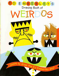 In honor of Halloween coming up fast, I got to thinking about how perfect Ed Emberley books are for this time of year. (Do you know him and his popular how-to drawing books?)

Ed Emberley’s Drawing Book of Weirdos and Ten Little Beasties (made with his daughter, Rebecca) especially come to mind, but all of his books involve creatures of all kinds.
They’re perfect precursors to Halloween costumes and crafts!

And there’s a new one!
Make a Face with Ed Emberley (Ed Emberley on the Go!).
It’s published by Two Little Birds, which was created by Ed’s daughter Rebecca Emberley. The company donates a book for every book purchased! Two birds! (Check out their partner Bess the Book Bus.)

This one has Ed’s signature step by step drawing with shapes technique AND includes bonus pages at the back to draw feelings, create bookmarks, and faces with accompanying speech bubbles. It’s all SO MUCH FUN!


And if you’re the kind who hunkers down for winter with the sewing machine, there’s Ed Embereley fabric at Cloud 9!

In closing, I like the way Ed describes himself on his website:
“I am an old grandpa kind of guy.”
He’s pretty modest, don’t you think?!
Thanks to Myrick Marketing for images!
+
This Picture Book Life is giving away one copy of Make a Face with Ed Emberley (Ed Emberley on the Go!), courtesy of Two Little Birds.
The greatest news is that it’s an activity book! You can draw right on the pages! Woo hoo and good luck!
I’ll contact the randomly chosen winner by email for your mailing address.
(Open to U.S. only—sorry about that far flung international readers! Good luck!)
fine furniture in picture books
A few weeks ago, Travis Jonker of 100 Scope Notes tweeted that he wanted to read a blog or blog post about furniture in picture books.
So, with his permission, I took it and ran. Travis was inspired by The Memory of an Elephant: An Unforgettable Journey. So I started there and looked for other bold furnishings, specifically seating, in picture books.
Behold, picture books in which furniture and decor take a front seat (har har):
")
MEMORY OF AN ELEPHANT: A Charles and Ray Eames DSW chair appears on the first spread of this one-of-a-kind book and the mid-century modern furniture cameos continue.


Eames DSW chair; fiberglass chairs via Modernica.


BKF/Butterfly chair; butterfly chairs via Plux.
")
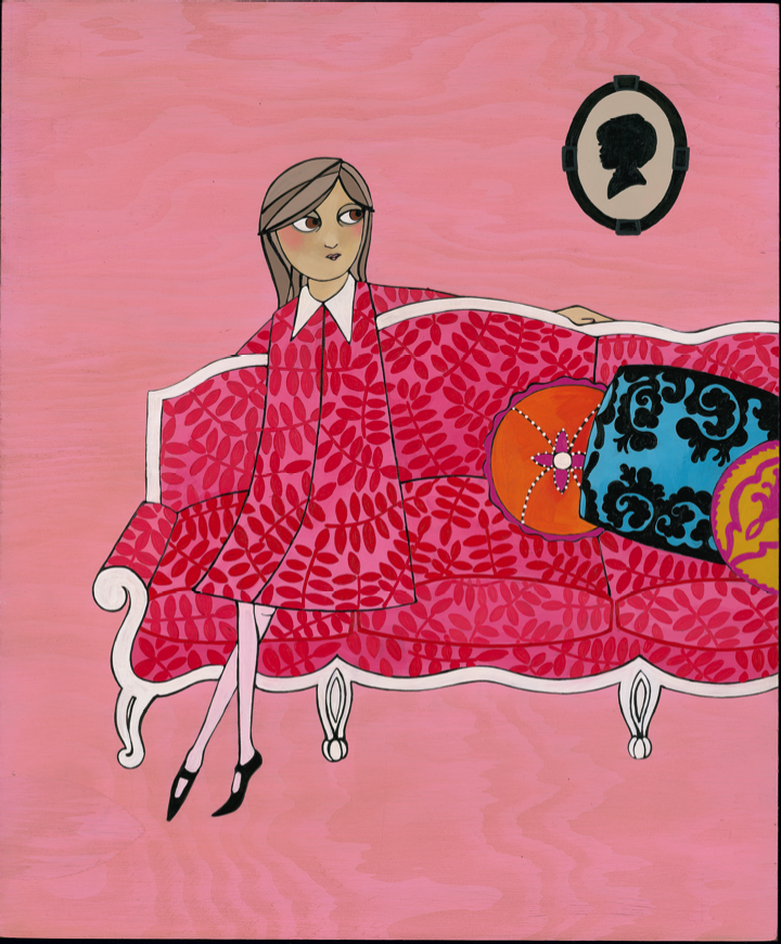
ROSIE REVERE, ENGINEER: This is a stylish book all around. Just one example is that the far left pink-haired aunt sits in what resembles a Solair Chair in black.


Solair Chair; solair chair via styleNorth.


Rosie’s peacock chair; peacock chair in natural via Anthropologie.
")
GASTON: That high back armchair! So French! Vibrant, floral, and perfect for reading!


Wingback Chair; Lotus Blossom Wingback Chair via Anthropologie.
(Thanks, Carter, for mentioning Gaston!)
")
MAUDE THE NOT-SO-NOTICEABLE SHRIMPTON: That hot pink settee! Pretty hot decor throughout this book!

Hot pink settee; hot pink settee via Decor Me Happy.


Club chair/Wingback chair; Fireside armchair via Anthropologie.
")
Finally, Jon Klassen appears to have an affinity for wooden chairs (in addition to hats!) Here’s one in THE DARK.

")
And there’s a lovely, ornate one in EXTRA YARN as well.


Mismatched vintage chairs of all kinds via Unearthed Vintage. So rustic and pretty!
As you take a peek at your own picture books, do let me know if there are any stand-out furniture pieces!
picture book typeface talk + alphabet wall sticker giveaway
Let’s talk about type, shall we? In picture books. And who better to do that with than picture book designer (and creator) Robin Mitchell Cranfield?
Her studio, hundreds & thousands, specializes in children’s books and has designed beautiful gems like How To and When I Was Small. And she’s created a special series of them herself with Judith Steedman: Windy & Friends (you must see these charming books/soon-to-be stop motion apps!!). To boot, both Robin and Judith have been shortlisted twice for the American Institute of Graphic Arts 50 books / 50 covers for their book design.
Windy Trailer from Windy & Friends on Vimeo.
This Picture Book Life: Tell us a bit about you as a designer:
Robin Mitchell Cranfield: At the moment, I’m working full time with my Windy partner, Judith Steedman to develop our series of books into interactive stories. We are working with traditional stop-motion animators and with Loud Crow to develop and release the app. We are also partnered with TwoFold films and SheepNoir productions.
TPBL: What are some of your favorite examples of type/font in picture books and why?
RMC: That‘s a hard question! I like a very wide range of type styles. For early readers, there’s a good argument to be made for simple typefaces that have very clear letter shapes. These would be variations on either geometric sans-serif typefaces or a Swiss style typeface. A good example of simple type treatment in books would be Dick Bruna — you’ll often see Mercator, a Dutch sans serif in a similar style to Helvetica, and Volta, a slab serif, in original editions of his books:


RMC: On the *other* hand, I love funny expressive type! So many great graphic designers produced books with expressive type like John Alcorn’s book “Books!”, and Paul Rand’s “Sparkle & Spin” which contain funny, found type specimens as part of the illustrations:


RMC: (I asked my creative partner on Windy, Judith Steedman, also a book designer who is in the studio today. She loves the Bruno Munari’s ABC book with its beautiful Normandia font. I agree!)
And I also love pretty, classic type:

TPBL: How do you go about choosing a type? What factors go into your decision-making process?
RMC: The three main factors are:
1. Who is reading this book? If it’s for early readers, I won’t use a quirky typeface for the main areas of text; it should be accessible to people who are learning the basic letter shapes. For cover type, it’s fair game to use more fun type, though.
2. What will set off the illustration style best? Sometimes, the type needs to be very quiet in order to let the illustrations take centre stage. Other times, funny or pretty type will bring out the illustration.
3. What characters or letters are in the words? Are there any opportunities in the pairings of letters or words to show off a nice aspect of a particular typeface? For example, if there’s an ampersand in the title, you don’t let that go to waste. 🙂
TPBL: What is your favorite font?
RMC: Oh, no! I can’t decide on that. I love so many, I just can’t answer. Probably my most used typeface is Akzidenz Grotesk.

TPBL: Can you tell us about the book HOW TO? How does the font serve the text?
RMC: I’m a big fan of Julie Morstad‘s work and I enjoy working within her colour palette, so that shapes how I approach her work. I always feel very happy when I am looking at it.

RMC: The cover image we used was a very quiet image, and it breaks some almost-rules about cover design in that the figure on the front is small and facing away from the viewer and secondly, there’s a lot of white space. So it was an image that would accommodate a bold and colorful typeface…If type can be large on a cover without overwhelming the image, that is great! The cover of a book is kind of a mini-poster, after all.


RMC: The interior text is much quieter to give the images full reign to tell their story. They are very dynamic and change from page to page, and they also contain subtle emotion. So, for these reasons, I felt it needed something quiet and of a lighter weight that the reader can take for granted and easily read, and allow them to focus on the images and the world being revealed.
TPBL: Anything you’d like to add?
RMC: I’m feeling a real shift in how I feel about contemporary typefaces right now. Up until a few years ago, I was mostly using type from the twentieth century like Rockwell, Trade Gothic, Akzidenz Grotesk, Electra, or classic typefaces like Jenson and Bembo.
But recently I’ve been really enjoying contemporary type, thinking about foundries like Porchez Typofonderie or Grilli Type.
There’s a lot more crossover between printed pages and the screen that is changing how we read. Inexpensive foundries like YouWorkforThem are popping up, and there are a lot of resources for students that weren’t as widely available a few years ago; I think it’s an exciting time for type design. The last few books I’ve done have been all with recently released type.
Thanks to Robin Mitchell Cranfield for emailing with me and for images! What a pleasure to have Robin’s expert answers on the blog today!!
+
Speaking of type, how cool is this alphabet wall sticker from Wonderwall Decal on etsy?! Well, Wonderwall is nice enough to be giving one regular sized alphabet decal to a reader of This Picture Book Life! I can picture it in a classroom, a kids’ room, or an office. A graphic design studio, an English faculty conference room, a nursery.
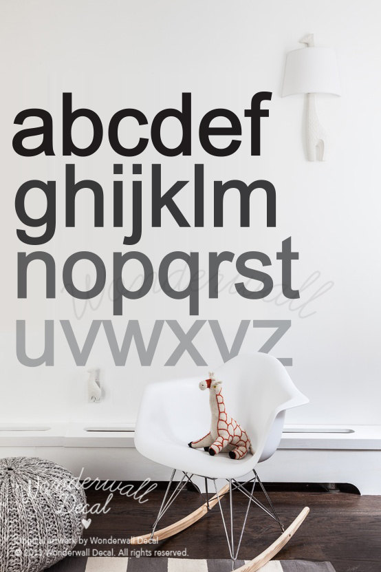
So clean and simple and sophisticated, yet, also the alphabet. That wonderful arrangement of letters from which we make words. Aaahhhh.

I’m also super excited about Wonderwall’s polka dot decals! I totally want those. My next favorite is the animal wall sticker because: woodland creatures. (The decals are removable matte vinyl, btw.)
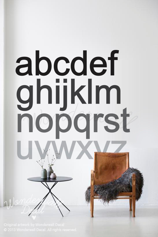
Enter to win a regular size Wonderwall Alphabet Decal (47″ by 47″) with the rafflecopter below!
a Rafflecopter giveaway
I’ll contact the randomly chosen winner by email for your mailing address. And the winner gets to choose custom colors!
(Open to international readers this time!! Giveaway ends Tuesday, September 30. Good luck!)
picture books as “flotation devices”
A couple of Saturday nights ago, my dude and I strolled around, peeking into art galleries in Chinatown here in Los Angeles. I love the contemporary art scene on Chung King Road, but I didn’t expect to find anything directly related to my love of picture books. And then I did.  Laura Tabbut‘s show, “Flotation Devices,” at Exhale Unlimited gallery consisted of child-sized life jackets hung on the wall. But they weren’t just life jackets. Laura cuts apart classic children’s books and affixes them to each flotation device.
 The Story about Ping by Marjorie Flack and Kurt Wiese. (1933).
There’s so much to love about this idea besides how cool they look as an installation:
*The way book jackets and life jackets relate as physical objects.
*And especially the way books can actually serve as flotation devices for kids (or adults). Lifesavers. Things that help us tumble along on the water instead of sinking.
 Maurice Sendak life jackets.
My literary flotation device as a child was Benjamin Dilley’s Thirsty Camel. No question. Did you have one? Or more?
Here’s what Laura Tabbut has to say about the origin of “Flotation Devices”:
“…This spring, my family was in the middle of selling our lake home on a tiny lake in Wisconsin. I took a break from packing books into boxes…Kayaking must be psychologically soothing, because in that small space of time in the boat, I was able to relive many fantastic summer memories, most of them with books. During our summers, we’d play on the lake all day, eat dinner, and then crash with a book in the evening. For my family and many friends this repeated pattern of playing and reading balanced our introverted and extroverted lives. It also shaped us uniquely as individuals, because the books we read informed our life choices.”
 Laura in a life jacket as a baby.
 I love that she fell asleep with those floaties on.
“So the flooding of all of those memories sparked this idea that reading can be a life saver. After I finished paddling around the lake, I went to put away my equipment in the boat house and pulled out a few very haggard children’s life jackets that I could cut up to use for patterns.”
 Books AND a float! And here’s Laura on her childhood flotation devices:
“As a child, I initially struggled with reading. I am an auditory learner and developed hearing issues during Kindergarten. But by the end of first grade I was reading fluidly. As an adult I look back at that time and realize how that struggle was critical to who I am today. As a teacher, I am constantly reminded of the value of getting kids to read or be interested in books at an early age.”

Laura’s flotation devices as a child included:
“The Velveteen Rabbit; The Runaway Bunny; The Josefina Story Quilt; A Birthday for Frances (Laura got Frances as a nickname because of this book!); Don’t Forget the Bacon!; The Wind Blew; Amelia Bedelia; Gila Monsters Meet You at the Airport; Caps for Sale, A Tale of a Peddler, and Some Monkeys & Their Monkey Business by Esphyr Slobodkina; Little House on the Prairie.”
 The Empty Pot by Demi (1996).
“When I was asked to show at Exhale Unlimited in Chinatown, I was also asked to use some Chinese children’s literature in my work. So I called my friend Beth, who is currently getting her PhD in Literacy and had taught for a couple of years in China to see what her recommendations would be.”
 The Dragon Prince: A Chinese Beauty & the Beast Tale by Laurence Yep and Kam Mak (1997).
 “I had already created the Maurice Sendak life jackets; those were the first jackets to be at the gallery. For me and for many, Sendak’s children’s literature taps into my wild primal urges and desires. Sometimes these urges contrast with the ‘safety’ of a life jacket.”
If you’re in the L.A. area, Laura has another show exploring banned books for Banned Books Week at APU until September 26.
Here’s to books continuing to keep us afloat and to putting literary flotation devices in little hands!
Thanks to Laura Tabbut for images!


