
-


Subscribe by Email
Popular Posts
Tag Archives: alphabet wall sticker
picture book typeface talk + alphabet wall sticker giveaway
Let’s talk about type, shall we? In picture books. And who better to do that with than picture book designer (and creator) Robin Mitchell Cranfield?
Her studio, hundreds & thousands, specializes in children’s books and has designed beautiful gems like How To and When I Was Small. And she’s created a special series of them herself with Judith Steedman: Windy & Friends (you must see these charming books/soon-to-be stop motion apps!!). To boot, both Robin and Judith have been shortlisted twice for the American Institute of Graphic Arts 50 books / 50 covers for their book design.
Windy Trailer from Windy & Friends on Vimeo.
This Picture Book Life: Tell us a bit about you as a designer:
Robin Mitchell Cranfield: At the moment, I’m working full time with my Windy partner, Judith Steedman to develop our series of books into interactive stories. We are working with traditional stop-motion animators and with Loud Crow to develop and release the app. We are also partnered with TwoFold films and SheepNoir productions.
TPBL: What are some of your favorite examples of type/font in picture books and why?
RMC: That‘s a hard question! I like a very wide range of type styles. For early readers, there’s a good argument to be made for simple typefaces that have very clear letter shapes. These would be variations on either geometric sans-serif typefaces or a Swiss style typeface. A good example of simple type treatment in books would be Dick Bruna — you’ll often see Mercator, a Dutch sans serif in a similar style to Helvetica, and Volta, a slab serif, in original editions of his books:


RMC: On the *other* hand, I love funny expressive type! So many great graphic designers produced books with expressive type like John Alcorn’s book “Books!”, and Paul Rand’s “Sparkle & Spin” which contain funny, found type specimens as part of the illustrations:


RMC: (I asked my creative partner on Windy, Judith Steedman, also a book designer who is in the studio today. She loves the Bruno Munari’s ABC book with its beautiful Normandia font. I agree!)
And I also love pretty, classic type:

TPBL: How do you go about choosing a type? What factors go into your decision-making process?
RMC: The three main factors are:
1. Who is reading this book? If it’s for early readers, I won’t use a quirky typeface for the main areas of text; it should be accessible to people who are learning the basic letter shapes. For cover type, it’s fair game to use more fun type, though.
2. What will set off the illustration style best? Sometimes, the type needs to be very quiet in order to let the illustrations take centre stage. Other times, funny or pretty type will bring out the illustration.
3. What characters or letters are in the words? Are there any opportunities in the pairings of letters or words to show off a nice aspect of a particular typeface? For example, if there’s an ampersand in the title, you don’t let that go to waste. 🙂
TPBL: What is your favorite font?
RMC: Oh, no! I can’t decide on that. I love so many, I just can’t answer. Probably my most used typeface is Akzidenz Grotesk.

TPBL: Can you tell us about the book HOW TO? How does the font serve the text?
RMC: I’m a big fan of Julie Morstad‘s work and I enjoy working within her colour palette, so that shapes how I approach her work. I always feel very happy when I am looking at it.

RMC: The cover image we used was a very quiet image, and it breaks some almost-rules about cover design in that the figure on the front is small and facing away from the viewer and secondly, there’s a lot of white space. So it was an image that would accommodate a bold and colorful typeface…If type can be large on a cover without overwhelming the image, that is great! The cover of a book is kind of a mini-poster, after all.


RMC: The interior text is much quieter to give the images full reign to tell their story. They are very dynamic and change from page to page, and they also contain subtle emotion. So, for these reasons, I felt it needed something quiet and of a lighter weight that the reader can take for granted and easily read, and allow them to focus on the images and the world being revealed.
TPBL: Anything you’d like to add?
RMC: I’m feeling a real shift in how I feel about contemporary typefaces right now. Up until a few years ago, I was mostly using type from the twentieth century like Rockwell, Trade Gothic, Akzidenz Grotesk, Electra, or classic typefaces like Jenson and Bembo.
But recently I’ve been really enjoying contemporary type, thinking about foundries like Porchez Typofonderie or Grilli Type.
There’s a lot more crossover between printed pages and the screen that is changing how we read. Inexpensive foundries like YouWorkforThem are popping up, and there are a lot of resources for students that weren’t as widely available a few years ago; I think it’s an exciting time for type design. The last few books I’ve done have been all with recently released type.
Thanks to Robin Mitchell Cranfield for emailing with me and for images! What a pleasure to have Robin’s expert answers on the blog today!!
+
Speaking of type, how cool is this alphabet wall sticker from Wonderwall Decal on etsy?! Well, Wonderwall is nice enough to be giving one regular sized alphabet decal to a reader of This Picture Book Life! I can picture it in a classroom, a kids’ room, or an office. A graphic design studio, an English faculty conference room, a nursery.
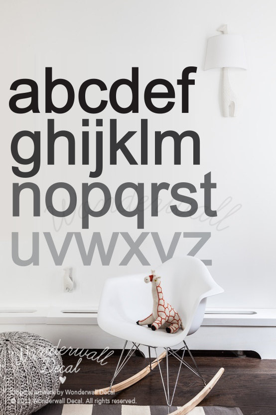
So clean and simple and sophisticated, yet, also the alphabet. That wonderful arrangement of letters from which we make words. Aaahhhh.

I’m also super excited about Wonderwall’s polka dot decals! I totally want those. My next favorite is the animal wall sticker because: woodland creatures. (The decals are removable matte vinyl, btw.)
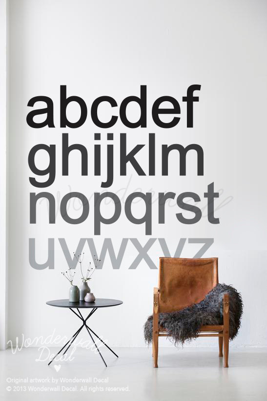
Enter to win a regular size Wonderwall Alphabet Decal (47″ by 47″) with the rafflecopter below!
a Rafflecopter giveaway
I’ll contact the randomly chosen winner by email for your mailing address. And the winner gets to choose custom colors!
(Open to international readers this time!! Giveaway ends Tuesday, September 30. Good luck!)


